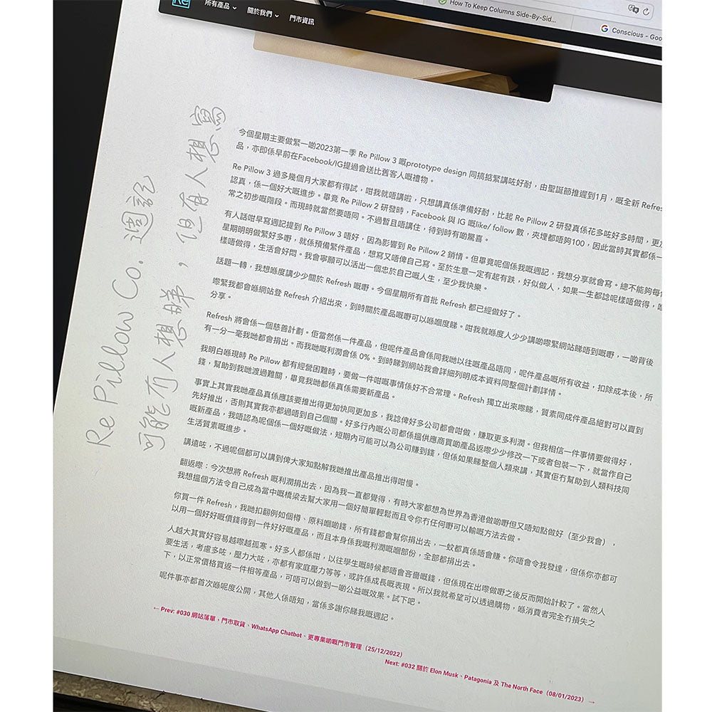
(Image: When designing the new website, I once thought of putting the "golden quote" from my weekly journal into the background of each journal entry, and I actually did it! However, the problem was that on the mobile version, the screen was too small and it overlapped with the main text, so I think I will not do it in the end.)
Welcome to this week's journal! This week, I only did one thing: build a new website. Those who know me better might know that I've loved computers since I was little. In my first and second years of secondary school, I taught myself to write an app (although it only had one function and a very rudimentary interface, a BMI calculator...). I basically copied it from a reference book, step by step, but it still cultivated my love for computers (which is why my nearsightedness kept getting worse every year in secondary school). Plus, I don't like social media; I prefer to stay in my room with the computer... and it's still like that now. So, in fact, all my websites are built by myself.
Actually, I started to dislike my current website about three months ago because it was built using a platform called Shopify. It's not as good as the one I redesigned myself in May 2022. I felt that to move forward, a redesigned website was crucial. It will be useful for doing certain things in the future (I won't reveal what they are for now!), because the current website structure has too many limitations and will likely cause problems later. It's like wanting to paint a famous painting, but right now you only have a pencil. Ideally, you'd bring watercolors and ink, more colors, so you can create your own masterpiece.
This past week, I've been sitting in front of the computer for thirteen or fourteen hours a day doing this. I actually really enjoy making websites, but it's quite tiring and boring. The new website should be launching in the next week; here are some pictures for you to see!

Translucent floating menu bar. Very clean and minimalist. Still haven't decided whether to make it black or white. A white frosted glass menu that "floats" on the interface, not stuck on one side. Still debating whether to use black or white.

The new website will use colorful and bold headings to highlight Re Pillow Co.'s youthful image.

Rounded corners throughout, with wide-spreading shadows, create depth on the website. Multiple images use rounded corners and shadows to indicate whether an item is clickable or stands out as a separate layer, giving the website a sense of physical depth.

Rounded corners throughout, with wide-spreading shadows, create depth on the website. Multiple images use rounded corners and shadows to indicate whether an item is clickable or stands out as a separate layer, giving the website a sense of physical depth.

The product cards all feature the same rounded corners and shadows.

The 404 Page. You'll like it. Finally: If the user misspells the URL, a mini-game will appear for them to play. This is a must-try feature.


#032 About Elon Musk, Patagonia, and The North Face (08/01/2023)
#034 New Year's Progress (22/01/2023)